

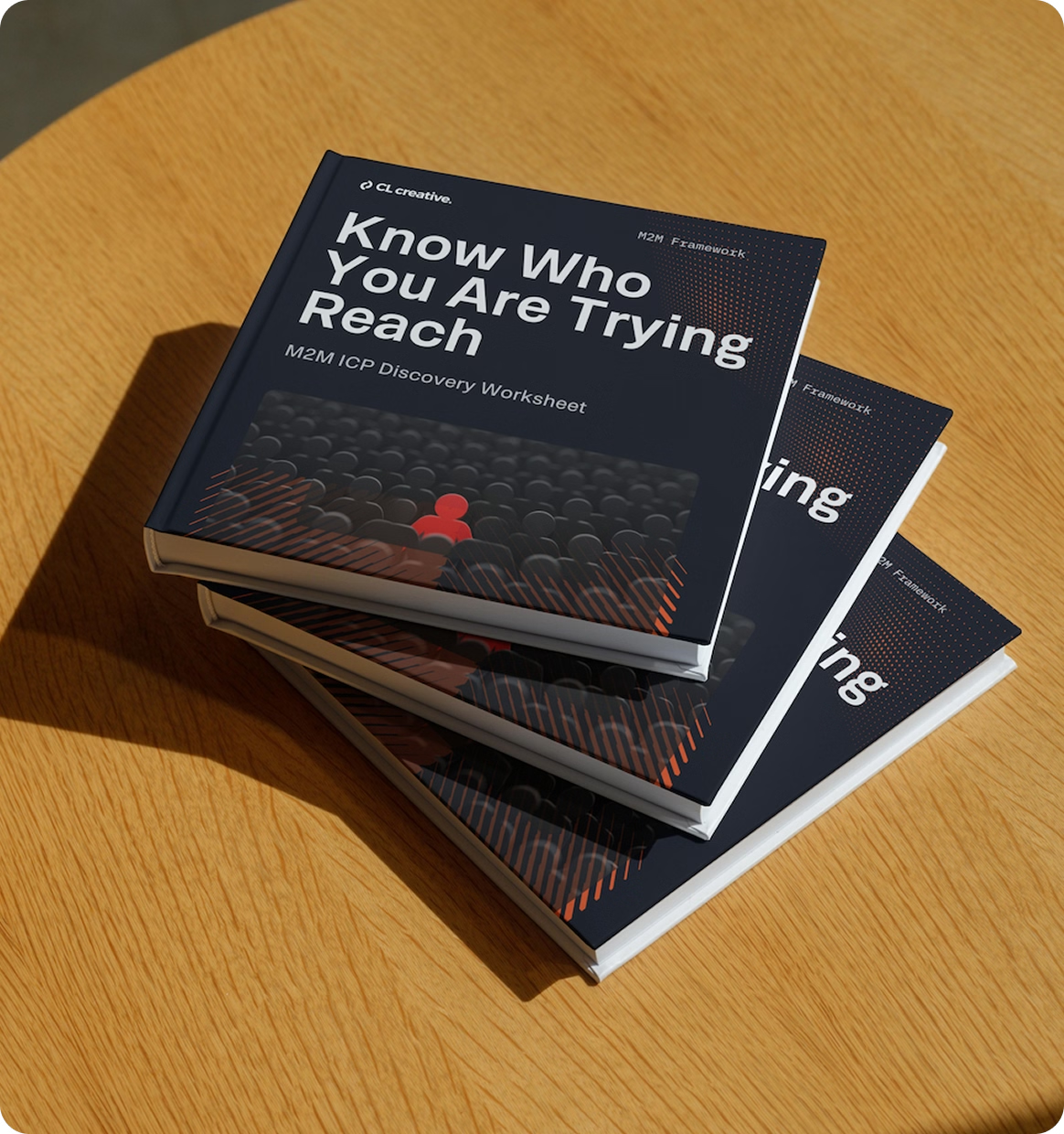
Get the M2M ICP Discovery Worksheet
Know who your website should speak to and what to say.
Your business is doing well. Revenue is solid. You've got a product or service people actually want. And your website? It looks great.
So why isn't it doing anything for you?
I hear this from business owners constantly. They invested in a good-looking site. The colors are on brand. The photos are professional. Everything is polished. But when I ask how many leads they're getting from their website, the answer is almost always the same.
"Most of our business comes from referrals."
That's not a flex. That's a warning sign.
A beautiful website that doesn't bring you customers is just an expensive digital brochure. And if you're running a business doing $500K or more in revenue, you can't afford to let your biggest marketing asset sit there collecting dust.
Let me explain why this happens and what you can do about it.
Looking Good and Working Well Are Two Different Things
Here's something most business owners don't realize. Design and strategy are not the same thing.
You can have the cleanest layout, the sharpest photography, and the trendiest fonts on the market. But if your site doesn't clearly communicate who you serve, what problem you solve, and why someone should choose you, none of that matters.
Think about it this way. When someone lands on your homepage, they make a decision in about five seconds. They're asking one question: "Is this for me?"
If your messaging is vague or generic, the answer is "I'm not sure." And they leave. No click. No inquiry. No sale. You never even knew they were there.
The data backs this up. Strategy-led website redesigns generate around 68% ROI, while visual-only redesigns sit at roughly 9%. That's a massive gap. And it tells you exactly where the real value lies.
It's not in the pixels. It's in the positioning.
The "Looks Great" Trap
I've seen this play out dozens of times. A business owner hires a designer, gets a sharp-looking website, and expects the leads to start rolling in. When they don't, they assume something is wrong with their marketing. So they throw money at ads. They post more on social media. They try a new email tool.
But the website, the one place where all that traffic is supposed to convert, still isn't doing its job.
Here's the thing. A website that looks great but doesn't convert is like a storefront with an amazing window display and a locked front door. People walk up, admire it, and walk away.
The problem isn't usually the design. It's what the design is (or isn't) saying.
What Your Website Should Actually Be Doing
Your website has three jobs. That's it.
1. Attract the right people.
Not everyone. The right people. Your ideal customers. The ones who already have the problem you solve and are looking for a solution. If your site tries to speak to everyone, it ends up speaking to no one.
2. Build trust fast.
A visitor who doesn't know you needs a reason to stick around. That means clear messaging, social proof, and content that shows you understand their situation. Not a list of your services. Not your company history. Their problem and your solution.
3. Make the next step obvious.
Every page should have a clear action the visitor can take. Book a call. Download a resource. Fill out a form. If someone has to hunt for how to work with you, most of them won't bother.
When your website does these three things well, it works like a salesperson who never sleeps. It qualifies leads, answers objections, and moves people toward a decision, all without you being in the room.
Why Most Websites Miss the Mark
So if it's that straightforward, why do so many websites fail at this?
Because most websites are built around the business, not the customer.
I see it all the time. The homepage leads with "Welcome to ____" or "We are a ____ company that provides ____." Then there's a page about the team, a page listing services, and a contact form buried somewhere in the footer.
None of that answers the visitor's real question: "Can you solve my problem?"
Here's what I mean. Compare these two headlines:
Generic: "We provide professional marketing solutions for growing businesses."
Specific: "Your marketing isn't broken. Your messaging is. We fix that."
The first one could be any agency on the planet. The second one calls out a specific problem and promises a specific outcome. It makes the right person stop scrolling.
That shift, from talking about yourself to talking to your customer, is where conversions start to happen.
The Framework I Use to Fix This
When I work with clients at CL Creative, I don't start with design. I start with strategy. Specifically, I use what I call the M2M Framework . Market to Message.

It breaks down into three steps.
Step 1: Know Your Market.
Before we touch a single wireframe, we figure out exactly who we're talking to. Not "small businesses" or "entrepreneurs." A specific person with a specific pain point and a specific goal.
What keeps them up at night? What have they already tried that didn't work? What words do they use when they talk about their problem?
When you understand your customer at that level, the messaging almost writes itself.
Step 2: Refine Your Message.
This is where we turn those insights into website copy that actually connects. Every headline, every section, every call to action is built around what your customer cares about, not what you want to say about yourself.
The goal is simple. When your ideal customer lands on your site, they should think, "This is exactly what I've been looking for."
Step 3: Generate Qualified Leads.
Now we build. The design, the layout, the user experience, all of it serves the strategy. We structure the site so that the right people take the right action. Whether that's booking a call, downloading a resource, or filling out a form, the path is clear and friction-free.
This is why strategy-led sites outperform pretty ones. They're built with the end goal in mind from the start.
An Example
Imagine your site looks fantastic. Custom photography. Clean layout. Great colors. But your conversion rate is under 1%.
Usually, when I see this, the problem is obvious. The homepage headline is something like "Innovative Solutions for Modern Businesses." It says nothing. There is no clear call to action above the fold. And the copy is all about the company's history and values instead of the customer's problem.
In this case, I’d rebuild the messaging using the M2M Framework. New headline that speaks directly to your ideal customer's frustration. Social proof moved closer to the call to action. A clear, single next step on every page.
Same traffic. Same product. But you’ll likely see the conversion rate jump significantly within the first 60 days. Not because the design changed. Because the message did.
What You Can Do Right Now
You don't need to rebuild your entire website tomorrow. But there are a few things you can check today that will tell you whether your site is working or just sitting there.
Read your homepage headline out loud. Does it clearly say who you help and what outcome you deliver? If it sounds like it could belong to any company in your industry, it's too generic.
Look at your site through your customer's eyes. Forget what you know about your business. If you were a stranger landing on this page for the first time, would you know within five seconds what this company does and whether it's for you?
Check your calls to action. Is there a clear next step on every page? Or does the visitor have to figure out what to do next on their own?
Ask yourself one question. Is your website talking about you, or talking to your customer?
If the answer is "about you," that's where the disconnect is. And that's where the opportunity is too.
Your Website Should Be Your Best Salesperson
You didn't build your business to have a pretty website. You built it to grow. And your website should be pulling its weight in that growth .

If your site looks great but isn't converting, it's not a design problem. It's a messaging problem. And the good news is, messaging can be fixed without starting from scratch.
It starts with understanding who you're really talking to. Then saying the right thing, in the right way, at the right time.
That's the difference between a website that looks good and one that actually works.
If you're serious about turning your website into a lead generation tool, I offer a free strategy session where we can talk about where you are now and where you want to go. No pitch. Just a honest conversation about what your website needs to start working for you.

Your Marketing Isn't Bringing in Leads and You Can't Figure Out Why
Score your marketing across 7 key areas in 5 minutes and find out exactly what's holding back your leads and what to fix first.
Questions You Might Be Asking
Most visitors decide within about five seconds whether your site is for them. That doesn't mean they book a call in five seconds, but it's when the mental filter happens. If your homepage headline and first section speak directly to your ideal customer's problem, conversion rates typically climb within 60 days even without new traffic.
No. Most of the time we can leave the design mostly intact and rework the copy, headline structure, and calls to action. The design is rarely the real issue. Fixing what the site says and where it asks for the next step usually produces the biggest lift with the least disruption.
Most copywriting starts with what the business wants to say. M2M starts with who you're talking to, what problem they're actively trying to solve, and the exact words they use to describe it. Only then do we write messaging. That order is what turns generic marketing copy into something that feels like it was written for one specific person.
Referrals are great, but they cap your growth at the size of your existing network. A website built to convert brings in people who've never heard of you and qualifies them before they ever talk to your team. One depends on other people doing your marketing for you. The other scales with your business.


