


Note: The video walks you through the implementation. Watch it to understand completely how to implement this in your Webflow project.
Copy this code into your project 👇
clamp(
  var(--_typography---h1--h1-min) * 1rem,
  ((var(--_typography---h1--h1-min) - ((var(--_typography---h1--h1-max) - var(--_typography---h1--h1-min)) / (var(--screen-size--screen-max) - var(--screen-size--screen-min)) * var(--screen-size--screen-min))) * 1rem + ((var(--_typography---h1--h1-max) - var(--_typography---h1--h1-min)) / (var(--screen-size--screen-max) - var(--screen-size--screen-min))) * 100vw),
  var(--_typography---h1--h1-max) * 1rem
)
Note: Webflow uses its own variable naming convention (e.g., --_typography---h1--h1-min). Make sure your variable names match what's defined in your Webflow project settings.
What is CSS Clamp and Fluid Typography?
The clamp() function is a powerful CSS tool that creates responsive values that scale smoothly between a minimum and maximum size based on the viewport width. When applied to typography, this creates "fluid typography" — text that seamlessly grows and shrinks as the screen size changes, without the jarring jumps of traditional media queries.
The Formula: clamp(minimum, preferred, maximum)
- Minimum: The smallest the value can ever be
- Preferred: A fluid calculation (usually viewport-based) that scales between min and max
- Maximum: The largest the value can ever be
Why Use Clamp for Typography?
The Problem with Traditional Approaches
Without fluid typography, designers typically use media queries to change font sizes at specific breakpoints:
h1 { font-size: 2rem; }

@media (min-width: 768px) {
  h1 { font-size: 3rem; }
}

@media (min-width: 1200px) {
  h1 { font-size: 4rem; }
}
This creates abrupt jumps in text size when crossing breakpoints, which can feel jarring and requires managing multiple declarations.
The Clamp Solution
With clamp(), typography smoothly scales across all viewport sizes with a single line of code:
- ✅ No jarring jumps — text flows naturally as the viewport changes
- ✅ Fewer lines of code — one declaration replaces multiple media queries
- ✅ Better reading experience — text is always optimally sized for the current screen
- ✅ Design consistency — maintains proportional relationships between heading levels
- ✅ Accessibility — respects user font-size preferences when using
remunits
Understanding the Variable-Based Approach
The code snippets below use CSS custom properties (variables) to make the clamp function highly maintainable and reusable. Here's why this matters:
🎯 Key Benefit: Instead of calculating complex clamp values manually for each heading, you simply change two numbers (min and max) and the formula does the rest.
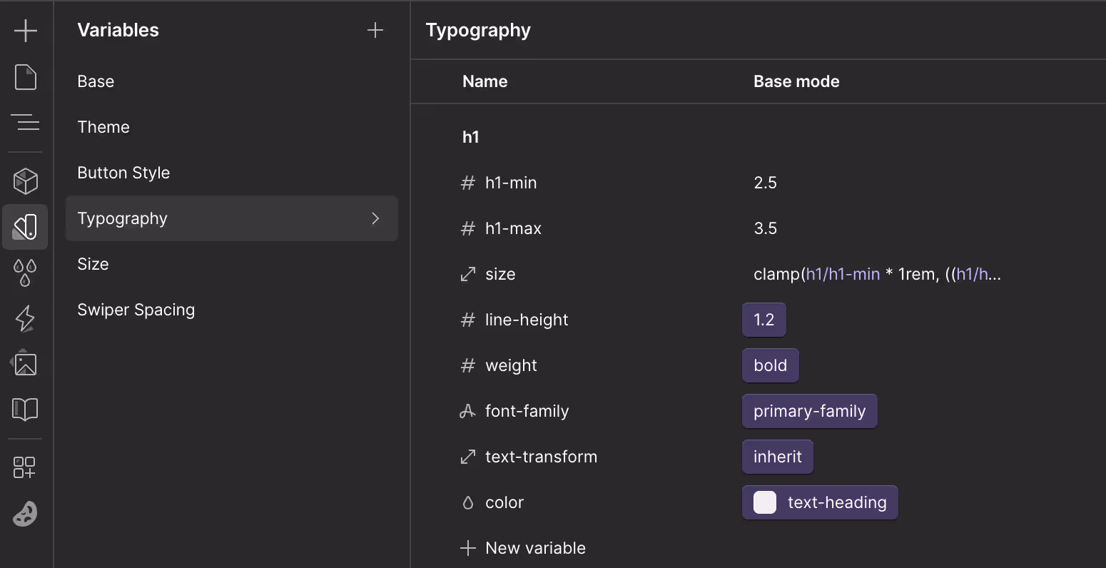
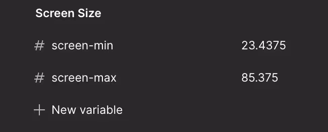
The Core Variables
:root {
  /* Screen size boundaries for fluid calculations */
  --screen-size--min: 23.4375; /* 375px in rem (375/16) */
  --screen-size--max: 85.375;  /* 1366px in rem (1366/16) */

  /* Typography scale for H1 */
  --h1-min: 2.5;  /* Minimum size: 2.5rem (40px) */
  --h1-max: 4;    /* Maximum size: 4rem (64px) */
}
Breaking Down the Formula
The complex-looking formula is actually performing a linear interpolation between your min and max values:
--h1-size: clamp(
  var(--h1-min) * 1rem,           /* MINIMUM: 2.5rem */
  (/* PREFERRED: Complex calculation */),
  var(--h1-max) * 1rem            /* MAXIMUM: 4rem */
);
What the preferred (middle) value does:
- Calculates the rate of change between min and max sizes
- Determines where on that scale the current viewport falls
- Outputs the appropriate size using
vw(viewport width) units
📐 In Plain English: The formula says "Start at the minimum size on small screens, grow proportionally as the screen gets wider, and stop growing at the maximum size on large screens."
Webflow Implementation
In Webflow, CSS variables are accessed with a slightly different syntax. The clamp is written as a single line for the font-size value:
Copy this code into your project 👇
clamp(
  var(--_typography---h1--h1-min) * 1rem,
  ((var(--_typography---h1--h1-min) - ((var(--_typography---h1--h1-max) - var(--_typography---h1--h1-min)) / (var(--screen-size--screen-max) - var(--screen-size--screen-min)) * var(--screen-size--screen-min))) * 1rem + ((var(--_typography---h1--h1-max) - var(--_typography---h1--h1-min)) / (var(--screen-size--screen-max) - var(--screen-size--screen-min))) * 100vw),
  var(--_typography---h1--h1-max) * 1rem
)
Note: Webflow uses its own variable naming convention (e.g., --_typography---h1--h1-min). Make sure your variable names match what's defined in your Webflow project settings.
Webflow Variable Naming Conventions
In Webflow, variables follow a specific naming pattern based on how they're organized in the Variables panel:
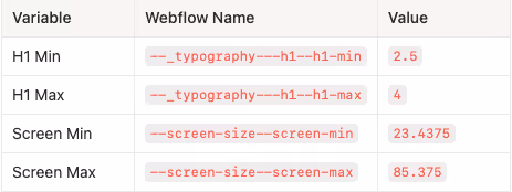
How Webflow Names Variables:
Webflow auto-generates variable names based on your folder structure in the Variables panel:
- Folder separators use triple dashes
--- - Variable name separators use double dashes
-- - Underscores prefix category folders (e.g.,
_typography)
So a variable named h1-min inside a folder h1 inside a folder _typography becomes:
--_typography---h1--h1-min
Astro/Vanilla CSS Implementation
For Astro projects or standard CSS, the same logic applies with cleaner variable names:
:root {
  /* Screen Sizes */
  --screen-size--min: 23.4375; /* 375px */
  --screen-size--max: 85.375;  /* 1366px */

  /* Heading 1 */
  --h1-min: 2.5;
  --h1-max: 4;
  --h1-size: clamp(
    var(--h1-min) * 1rem,
    (
      (
          var(--h1-min) -
            (
              (var(--h1-max) - var(--h1-min)) /
                (var(--screen-size--max) - var(--screen-size--min)) *
                var(--screen-size--min)
            )
        ) * 1rem +
        (
          (var(--h1-max) - var(--h1-min)) /
            (var(--screen-size--max) - var(--screen-size--min))
        ) * 100vw
    ),
    var(--h1-max) * 1rem
  );
  --h1-font-family: var(--font-primary);
  --h1-line-height: 1.2;
  --h1-weight: 700;
}
How to Add More Heading Sizes
Simply copy the pattern and adjust the min/max values for each heading level:
/* Heading 2 */
--h2-min: 2.25;
--h2-max: 3;
--h2-size: clamp(
var(--h2-min) * 1rem,
(
(
var(--h2-min) -
(
(var(--h2-max) - var(--h2-min)) /
(var(--screen-size--max) - var(--screen-size--min)) *
var(--screen-size--min)
)
) * 1rem +
(
(var(--h2-max) - var(--h2-min)) /
(var(--screen-size--max) - var(--screen-size--min))
) * 100vw
),
var(--h2-max) * 1rem
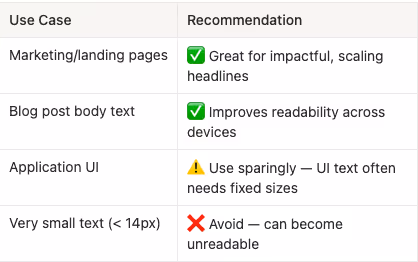
);Quick Reference: When to Use This
Key Takeaways
- Clamp eliminates breakpoint jumps — Typography scales smoothly instead of snapping between sizes
- Variables make it maintainable — Change two numbers to adjust any heading's responsive behavior
- Use rem units — This respects user accessibility settings for font size
- Define your screen boundaries once — The
screen-size--minandscreen-size--maxvariables are reused across all typography - The formula handles the math — You don't need to manually calculate the preferred value for each use case

End to End Webflow Design and Development Services
From Web Design and SEO Optimization to Photography and Brand Strategy, we offer a range of services to cover all your digital marketing needs.

Webflow Web Design
We design custom Webflow websites that are unique, SEO optimized, and designed to convert.
Webflow Support
Get dedicated design and development support from a Webflow Professional Partner without the overhead of a full-time hire or the hassle of one-off project quotes.


Claim Your Design Spot Today
We dedicate our full attention and expertise to a select few projects each month, ensuring personalized service and results.

