


If you've ever tried to create an overlapping section or a clean two-tone background in Webflow, you've probably run into one of two problems.
Either you end up with a bunch of empty divs just for background color… or things look fine on desktop and completely fall apart on mobile.
In this post, I'm going to walk you through three different techniques for creating overlapping sections and two-tone backgrounds—and help you understand when to use each one.
Technique 1: CSS Gradients in the Webflow Style Panel
This is the simplest and most "Webflow-native" approach. It doesn't require any custom code, and it works great for straightforward designs.
How it works:
- Select your section
- Open the Styles panel and click the + button to add a background
- Choose Gradient and set it to go downward (180°)
- Add four color stops:
- Stop 1: Transparent (0%)
- Stop 2: Transparent (50%)
- Stop 3: Your background color (50%)
- Stop 4: Your background color (100%)
The key: Make sure your two center stops are at the exact same percentage. This creates that crisp, hard line instead of a blurry gradient.
Adjusting for mobile:
If you need to adjust the split point on smaller screens, you'll have to manually update both center stops on each breakpoint. This is where things can get tedious—if you want the line at 40% on mobile, you need to change both the transparent stop and the colored stop to 40%.
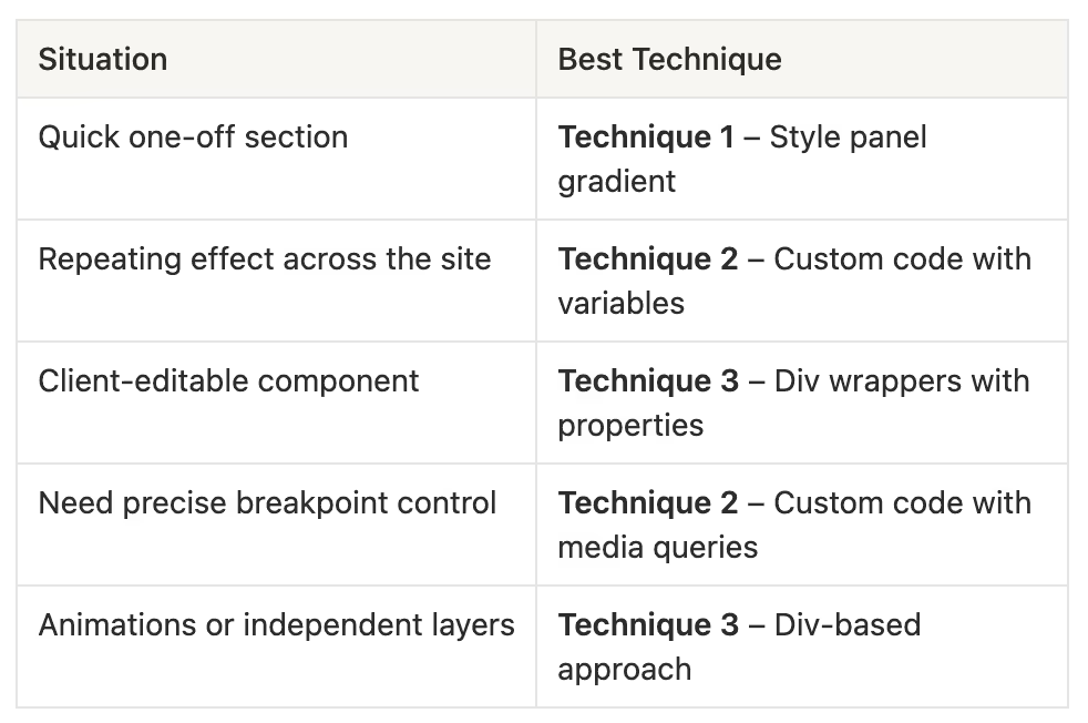
When to use this method:
- Quick, one-off sections
- Designs where the split point stays consistent across breakpoints
- When you want to stay inside Webflow's native tools
Technique 2: CSS Gradients with Custom Code
This method does the same thing as Technique 1, but uses a code embed instead. It's more work upfront, but much easier to manage if you're using this effect throughout your site.
Why use code instead of the style panel?
- You only need to change one
--splitvariable instead of two color stops - You can use media queries to fine-tune breakpoints beyond Webflow's defaults
- You can turn it into a reusable component
Here's the code:
<style>

:root {
  --top: var(--_theme---theme-background--bg-dark);
  --bottom: var(--color-brand--transparent); /* Desktop */
  --split: 40%; /* iPad */
  @media (max-width: 62rem) {
    --split: 30%;
  } /* Mobile Portrait */
  @media (max-width: 30rem) {
    --split: 20%;
  }
} /* Change the class to match your section */
.section_pastors {
  background: linear-gradient(
    to bottom,
    var(--top) 0%,
    var(--top) var(--split),
    var(--bottom) var(--split),
    var(--bottom) 100%
  );
}


</style>
How to set up your color variables:
- Go to your Webflow Variables panel
- Click the three dots on your color variable
- Click Copy CSS
- Paste that value into your code embed where
--topor--bottomis defined
Pro tip: Turn this into a component. Once you've got the code written, you can drop in the component, unlink it, and just update the section class and variable values. Much faster than rebuilding it every time.
When to use this method:
- You're using two-tone backgrounds throughout the site
- You need more control over breakpoints
- You want a reusable, easy-to-update system
Technique 3: Div-Based Background Wrappers with Component Properties
This is the most advanced technique, but it solves a problem the first two can't: giving clients control over background colors through component properties.
If you're building a component that gets used across many pages—and the background colors need to change depending on context—this is your solution.
The setup:
- Create a background wrapper div inside your component (set to
position: absolute,width: 100%,height: 100%,display: flex, andz-index: 0) - Inside that wrapper, add two more divs—one for the top portion, one for the bottom
- Set the top div height to control where the split happens (e.g., 30%)
- Set the bottom div height to 100% so it fills the remaining space
- Give both divs a base class like
background-color - Create combo classes for each color option (e.g.,
bg-light,bg-dark,bg-light-2)
The magic: Expose these as component properties.
Once your classes are connected to component properties, you (or your client) can change the top and bottom colors right from the component settings panel—no digging into the structure required.
When to use this method:
- The component is used on many pages with different background needs
- You need to give clients control over colors without touching the build
- You want the flexibility to toggle the top panel on or off entirely
Which Technique Should You Use?
Wrapping Up
Overlapping sections and two-tone backgrounds are one of those details that can make a design feel polished and intentional. The trick is picking the right technique for the job:
- Start simple with the style panel if it's a one-time thing
- Use code when you need consistency and easier updates across breakpoints
- Build with divs when you need maximum flexibility or client control
Hopefully this gives you a clear framework for tackling these layouts in your next Webflow project. If you have questions or want to see a specific technique covered in more detail, drop a comment below!

End to End Webflow Design and Development Services
From Web Design and SEO Optimization to Photography and Brand Strategy, we offer a range of services to cover all your digital marketing needs.

Webflow Web Design
We design custom Webflow websites that are unique, SEO optimized, and designed to convert.
Webflow Support
Get dedicated design and development support from a Webflow Professional Partner without the overhead of a full-time hire or the hassle of one-off project quotes.


Claim Your Design Spot Today
We dedicate our full attention and expertise to a select few projects each month, ensuring personalized service and results.

