Understanding Visual Hierarchy in Web Design
Today, we're diving into a web design principle that you need to understand to execute effective designs. That principle is visual hierarchy.
This topic is not only essential for graphic and web designers but also incredibly interesting for anyone curious about the principles that drive effective visual communication.
What is Visual Hierarchy?
Visual hierarchy refers to the arrangement or presentation of elements in a way that implies importance. It influences the order in which the human eye perceives what it sees.
Key Elements of Visual Hierarchy
- Size and Scale: Larger elements will likely attract more attention than smaller ones.
- Color and Contrast: Bright and contrasting colors stand out more than muted or similar tones.
- Alignment and Spacing: How elements are aligned (e.g., left, right, center) and spaced from each other can affect their perceived importance.
- Repetition and Pattern: Repeated elements or patterns can create a sense of organization and importance.
- Typography: Variations in font size, style, and spacing can make textual information stand out.
- Texture and Style: Different textures or styles can draw the eye to certain parts of a design.
- Depth and Dimension: The use of shadows, layering, or three-dimensional effects can make some elements pop more than others.
Visual hierarchy is crucial because it helps designers create designs that guide the viewer’s attention in a specific order, which is especially important in conveying information efficiently and effectively.
Why is Visual Hierarchy Important?
In any design, from websites to posters, visual hierarchy plays a pivotal role.
It helps in structuring content in a way that's digestible and pleasing to the eye.
For instance, in web design, a well-thought-out visual hierarchy can improve usability and user experience, making it easier for visitors to find what they're looking for and take action.
Real-World Applications
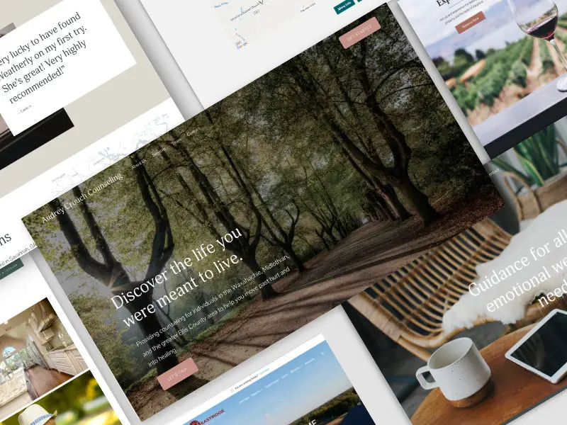
To give you a practical sense of how visual hierarchy works, let’s consider a website. The most crucial information, like the call to action or main navigation, is typically larger, bolder, or in a contrasting color.
This isn’t by accident – it’s a deliberate choice to draw the viewer’s attention to these elements first.
Conclusion
Understanding and implementing visual hierarchy is a skill that can significantly enhance the effectiveness of your designs.
Whether you're a seasoned designer or a beginner, grasping these concepts can help you communicate your ideas more powerfully and create designs that resonate with your audience.
I hope this post gives you a clearer understanding of visual hierarchy.
If you have any questions send me a message.
And if you're interested in more design tips and insights, don’t forget to check out my YouTube Channel.
Remember, design is not just about making things look good; it's about making them communicate better.
End to End Webflow Design and Development Services
From Web Design and SEO Optimization to Photography and Brand Strategy, we offer a range of services to cover all your digital marketing needs.

Webflow Web Design
We design custom Webflow websites that are unique, SEO optimized, and designed to convert.
Webflow Support
Get dedicated design and development support from a Webflow Professional Partner without the overhead of a full-time hire or the hassle of one-off project quotes.
Claim Your Design Spot Today
We dedicate our full attention and expertise to a select few projects each month, ensuring personalized service and results.


