
![10 Ways to Increase Your Website’s Credibility and Win More Customers [The Ultimate Guide]](https://cdn.prod.website-files.com/627fa16857254f6bf333d073/62bdc39d5b4a6e3a9c1e16a0_website-credibility-header%20(1).avif)


What are the 10 ways to increase your website's credibility and win more customers?
Your website is an important asset in your business. It‘s where people go to find out about you and what you offer. But if they don’t trust you or your company they won’t buy from you. So, how do you increase your site’s credibility?
Here are 10 ways to increase your websites credibility to potential customers:
- <a href="#1"> (1) Make the information on your website easy to verify</a>
- <a href="#2"> (2) Show there is a real organization behind your website</a>
- <a href="#3"> (3) Highlight your expertise</a>
- <a href="#4"> (4) Include social proof</a>
- <a href="#5"> (5) Make it easy for your clients to contact you</a>
- <a href="#6"> (6) Use standard design principles</a>
- <a href="#7"> (7) Make your website easy to navigate and useful</a>
- <a href="#8"> (8) Update your website's content regularly</a>
- <a href="#9"> (9) Keep promotional content to a minimum</a>
- <a href="#10"> (10) Fix errors on your website and keep your website up</a>
<h2 id="1"> (1) Make the information on your website easy to verify</h2>
Google Business Profile

One way to make sure your information is easy to verify is to setup a Google Business Profile. You already should have a profile for reviews and local SEO purposes. If you don't have a Google Business Profile, set one up ASAP.
Google has a few checks they utilize to verify that your business is real. They go the extra mile and send a postcard to the address listed for your business with a verification code you have to enter into your Google Business Profile for approval.
Seeing your business listed on Google's Map Pack puts customers at ease, helping them feel more confident you are a real business.
Links
Another thing you can do is link out to other organizations you are a part of that have your business listed on their website. If it is a credible organization or business, people will associate its credibility with your own.
Not all links are the same
When linking to another company, try to do so naturally. If you are a member of the local chamber of commerce, include that information on your about page with a link directly in the text to your local chamber. You could say something like,
“ We take pride in our local community. We are involved in the Chamber of Commerce and XYZ organization.”
Create a hyperlink for the Chamber as well as each of the organizations you are affiliated with in your local community.
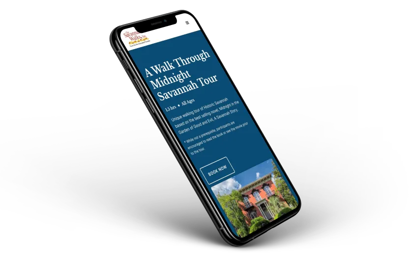
<h2 id="2"> (2) Show there is a real organization behind your website </h2>
Photos are a key to increasing your credibility. When considering which photos to include, try to avoid heavy use of stock photos. I’m not saying you shouldn’t use stock photos. I use them from time to time. But limit their use if at all possible and use your own pictures. You may have to spend a little and hire a professional photographer, but it will be worth it.
What should you take pictures of?

- Your office - If you have a brick-and-mortar location, include photos of your office and people working.
- Your products - High-quality pictures of the products you sell are key. Hire a professional photographer if you can. Or invest in your own equipment. You don’t need the best or most expensive camera. Instead, focus on lighting. A good lighting setup will do wonders for your product photos.
- Your work - If you don’t have a brick-and-mortar location, post pictures of your work product. Service based businesses like a plumber, electrician, or contractor, can post pictures of their truck, completed projects, or before and after photos.These are great ways to showcase your work, as well as increase your credibility.
- Your portfolio - If you are an artist or designer, you need a portfolio. If you can include a link to your client's website, especially if your work product is shown on the website, that adds more credibility.
<h2 id="3">(3) Highlight your expertise</h2>
Your website content and your services should highlight your expertise.

If you have experts on your team, or those who are leading contributors in their field, make sure to include their credentials in their bio and link to any relevant articles, journals, or associations.
Anyone can claim to be an expert. But not everyone has the credentials, association and experience to back that claim up.
<h2 id="4">(4) Include social proof</h2>
Is it evident that honest and trustworthy people stand behind your website? If you don’t have any reviews, customers will assume otherwise.

Reviews are key.
Customers want to know that other customers just like them have bought your product or used your service.
Reviews convey to others that your product or service is worth it and that you are trustworthy.
Not all reviews are the same

Anyone can post a review on a website. To erase doubt that your review is genuine, you should include several items along with the review.
- Picture
- Name
- Title
- Company
- Link – Link to their company or link to a page on their website that highlights your work.
How do you know if you can post a review?
Reviews are an excellent way to increase your credibility, but you should make sure your clients are comfortable with you posting your review.
My rule of thumb is that if they left a review on a social site like Facebook or on my business’ Google profile, it is fair game for me to post their review on my website.
If they sent me an encouraging email or text after our project wrapped up, I should ask their permission.
<h2 id="5">(5) Make it easy for clients to contact you</h2>

Phone Number, Email, and Address
Contact forms are great. I have one on my website and I put them on all my client’s websites. But you also should include your phone number, an email address, and a physical address, if you have one.
Customers may opt to use the form, but knowing that they could contact you by phone, email, or stop by your business enhances your credibility. It tells them there is a real person behind the business. And if they need to call you, they can.
List your contact information on more than one page
Providing a way for your clients to contact you is crucial, but no one wants to dig for the information. Make it easy by including your contact information in multiple places on your website.
Your navigation bar and footer show up on every page. Include your contact information in both. A simple phone number or contact button will do in your navigation bar. You don’t want to clutter it up with too much information. Instead, use your footer for the details like address, email, social profiles, and phone number.
<h2 id="6">(6) Use standard design principles</h2>
Yes, rules are meant to be broken, but not all the time. Breaking design rules work well if it is intentional and not overused.
But for most of us, we don’t need to concentrate on breaking the rules. Instead we should concentrate on learning and using them. You have to know and use the rules consistently before you are able to break them in a meaningful way.
What are common design principles you need to use?
- Layout
- Hierarchy
- Typography
- Color
- Images
- Consistency

Layout
Less is more. You don’t have to fill up the entire page with information or images. White space allows a design to breathe and helps to direct your customer to what is important.
Hierarchy
Everything can’t be the most important thing. Something has to stand out. One message has to be more important than another.
You accomplish this with hierarchy.
The text, image, graphic, illustrations you want your customer to see first, should be displayed most prominently. Usually this is done by making it bigger than the other items or displaying it first in a list.
Typography
Choose text that is easy to read.
Comic Sans might be your favorite font, but you probably shouldn’t use it on your website. It is difficult to read and is not professional looking. Instead, choose fonts that pair well with your business.
Font size is also important. The font should be large enough for the average reader. I would suggest going no smaller than 16 px when choosing a font size for body copy. 18 px is better, and sometimes I opt to use 20 px or more. Whatever size you choose, make sure it is readable by most people.
Color
Use the 60-30-10 rule. 60% of your design is one color, 30% is another, and 10% of your design is a third color. That doesn’t mean you can’t add in additional colors, but sticking to 3 or 4 colors will help keep your design consistent and increase your credibility.
How do you determine your three colors?
First, pick a primary color. One that you really like and doesn’t sear your clients' retinas. Avoid super bright colors that are hard to look at.
Once you have a color you like – head over to a color tool like Adobe Color and enter in your color. The tool will give you a bunch of different color palette options from which to choose.
Another tool is Color Hunt. You can select a mood – retro, neon, fall, winter, etc and they will generate a color palette based on your mood.
Once you have selected your color palette, you should apply the 60/30/10 rule. First decide what your background color is going to be. Choose something you would want to look at for an extended period of time. Typically neutral colors work well for the background.
After you have selected your background color, choose which of your two remaining colors will be more dominant than the other. If one is brighter, bolder, or stands out more, you might want to utilize that as your 10% accent color.
Apart from the three colors you selected, I also include black and white in my palette. Typically I use a black or white colored font, depending on the background color. That is where your 30% color comes in. You can use your 30% selection as a section background to differentiate that section from a previous section.
As you design, keep color contrast in mind, especially when it comes to typography. A tool like Adobe Color’s accessibility tool will tell you if there is enough contrast between your colors. Just plug in your background color and your font or graphic color and it will tell you if you passed or not.
Images
Many of us are visual people. We are drawn to images, especially good images. Make sure you have high quality images on your website.
By all means, don’t put clipart on your website! That is a major credibility killer.
You can find good high quality images from stock photo sites. If you don’t want to pay for them, sites like: Pexels and Unsplash offer stock images for free.
Consistency
You can apply all the points above flawlessly, but if you lack consistency, you will still lose credibility.
Your layout, colors, typography, images, and hierarchy should all be applied uniformly throughout your website.
If your paragraph font size is 18 px on one page, it should be 18 px on every other page. The same for your headings. Your H1, H2, H3, H4, etc should all be standardized.
That doesn’t mean you can’t make these elements smaller or larger from time to time, but you should have a good reason for why you are changing their size.
Consistency in your design adds professionalism and enhances your credibility.
<h2 id="7">(7) Make your website easy to navigate and useful</h2>
You can agonize over your website’s design, but if your site is hard to navigate, your credibility will suffer. You want to keep the navigation as simple as possible. Don’t make it difficult for visitors to find what they want.
Apply the 2-click rule
A page should never be more than 2-clicks away from the top level pages.
For instance, you might have a services landing page your visitor clicks on from the navigation bar. The next click should take them to a service page that explains that service. They shouldn’t have to click through three different pages to figure out what you do and how to get in touch with you. That is too much digging.
Keep animations short
Animations and pre-loaders are cool. They add visual interest and show you have invested in your website, but too much of a good thing is bad.
If a customer has to sit through a long page load animation every time they click on a page, they are going to get frustrated and click away from your site. A good practice is to keep page loads under 1-2 seconds.
Preferably only use a long page loader on the home page. The other pages on your website should use minimal loading animations.
If you have a long animation on your homepage, consider limiting long animation sequences to once a day.
Keep the user in mind. Make your site easy to navigate, loads quickly, and is useful.
<h2 id="8">(8) Update your website’s content regularly</h2>
More credibility is assigned to websites that are updated on a regular basis.
If you have announcements on your site from five years ago, if you have employees that aren’t working their anymore, or if you are still promoting an event that happened last week or even a day or two ago, your credibility is going to suffer.
Audit your website from time to time. Remove old material and make updates. Even small updates make a difference and show your customers that you are engaged and active.
<h2 id="9">(9) Keep promotional content to a minimum</h2>
Avoid ads, if at all possible
If at all possible, avoid hosting ads on your website. There is a reason “Reader Mode” in Apple’s Safari browser exists. People hate intrusive pop ups and blinking ads that make it hard to read your content.
Make ad design consistent
If you must have ads on your website, try to make them as unobtrusive as possible while still accomplishing their purpose. By all means, try to make sure they look good next to your other content.
Advertisers want to draw a consumer's attention to their product, but if you are able, try to make sure they look good next to your content. Sizing and placement go a long way here.
Distinguish paid content from your content
If you have sponsored content, like a paid long-form blog post, clearly distinguish it from your other content. Make sure your readers and visitors know it is a paid piece of content. If it is good, it will convince them to buy the product. You don’t have to trick them into thinking you wrote it for it to be effective. That is a sure fire way to lose credibility with your audience.
<h2 id="10">(10) Fix errors on your website and keep your website up</h2>

Not only do you need to keep your site up to date, but you also need to make sure that there are no errors on your site.
Fix Errors
When you are auditing your website for old material, look for typographical errors and broken links. Even small errors can hurt your credibility.
Uptime
Make sure your site is up and running. Sites go down from time to time. But your site shouldn’t keep going down. A site with a low uptime percentage loses credibility.
Make sure you are hosting your site with a reputable hosting service. And choose a website builder like Webflow that doesn’t rely heavily on third party plugins to stay up and running.
Conclusion
If you implement these 10 strategies, you will be well on your way to gaining and keeping credibility so that you will win more customers. Your business won’t miss out on converting visitors into paying customers, which will allow your business to thrive. Start implementing these strategies today. If you need help, feel free to reach out.

End to End Webflow Design and Development Services
From Web Design and SEO Optimization to Photography and Brand Strategy, we offer a range of services to cover all your digital marketing needs.
Webflow Web Design
We design custom Webflow websites that are unique, SEO optimized, and designed to convert.
Webflow Support
Get dedicated design and development support from a Webflow Professional Partner without the overhead of a full-time hire or the hassle of one-off project quotes.


Claim Your Design Spot Today
We dedicate our full attention and expertise to a select few projects each month, ensuring personalized service and results.

