Ready to take your business to the next level?
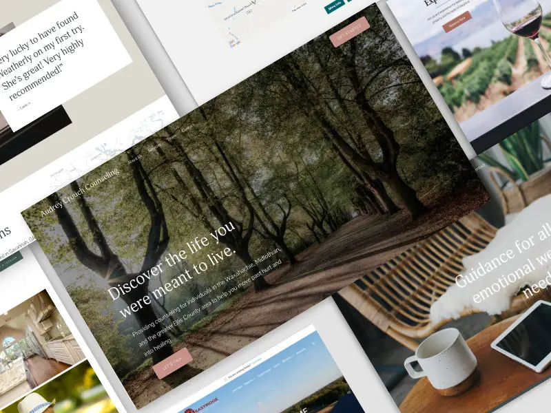
Expand your reach and grow your business with our seamless integration of web design and expert SEO strategies. Apply now to secure your spot.

Expand your reach and grow your business with our seamless integration of web design and expert SEO strategies. Apply now to secure your spot.


Download your free copy of The Ultimate Guide to SEO and How to Beat the Competition now!

Increase Website Traffic

Improve Search Rankings

Boost Conversions